Why Every Union Needs a Modern Website
A practical guide for union presidents, business managers, and office leaders
A union website isn’t “marketing” in the commercial sense. It’s closer to an office front desk, a bulletin board, a member handbook, and a public record—all rolled into one.
And in 2025, that front desk is increasingly digital and mobile. In the U.S., about 91% of adults own a smartphone. Pew Research Center A meaningful share of adults are also “smartphone dependent” (they use a smartphone but don’t have home broadband), which makes mobile-friendly access even more important for basic information.
This article is written for union leaders who want a clear, non-technical, non-sales explanation of:
what a modern union website should do
why it matters to operations, member service, and credibility
the most common website mistakes unions make (and how to fix them)
a realistic plan to modernize without turning it into a giant project

Serving American Locals: Our platform is built to support unions across the United States, with U.S. locals operating on our U.S.-based systems to keep everything aligned with domestic operations and member needs.

Serving Canadian Locals: Canadian unions are supported through dedicated Canadian infrastructure, ensuring your local’s data, workflows, and member services remain inside Canada—built for Canadian unions, by a team that supports them every day.
The core idea: your website is member service infrastructure
When your website works well, it reduces friction for everyone:
Members find answers without calling the office for routine items.
Staff spend less time repeating the same information.
Stewards and reps can point people to a single source of truth.
The public (and potential members) sees a union that’s organized, current, and credible.
When it doesn’t work, it creates real costs:
More calls and emails for basic questions
Missed deadlines and confusion (events, meetings, benefit links, trainings)
Rumors fill the information vacuum during bargaining or disputes
Members feel disconnected, especially across multiple job sites or shifts
A modern website is not about being flashy. It’s about being clear, fast, accessible, and current.
1) Your members are already “mobile-first,” even if you aren’t
Union life doesn’t happen at a desk. It happens:
on a job site at 6:00 a.m.
on break
in a truck
between shifts
on a phone at home
Globally, mobile slightly exceeds desktop in web browsing share (for example, StatCounter shows mobile around 52% vs desktop around 48% worldwide in late 2025). StatCounter Global Stats Even if your local’s membership skews older or office-based (where desktop use can be higher), mobile is still a must, because mobile is where urgency lives.
Practical implication: if someone can’t do these quickly on a phone, your site isn’t serving them:
find the hall address and office hours
call the union office with one tap
find steward contact info
read the latest update (bargaining, meeting, safety notice)
download a form that’s actually usable on a phone
Also, Google primarily uses the mobile version of content for indexing and ranking (“mobile-first indexing”). Google for Developers So if your mobile site is thin, broken, or missing key information, you’re harder to find—especially for members trying to locate the right local quickly.
2) A modern union website reduces office workload (and improves service)
If you want a business-manager way to think about the website, think of it as deflecting repetitive calls while improving quality.
The “top call drivers” a good website can shrink
Most union offices repeatedly answer variations of:
“Who do I contact?”
“Where is the hall / when are hours?”
“When is the meeting?”
“How do I sign up for training?”
“Where are the benefit links?”
“What’s happening with bargaining?”
“How do I file a grievance / report an issue?”
A modern website doesn’t replace personal help—but it ensures that when members do call, it’s for issues that actually require staff time.
A simple test
If you get the same question more than 10 times per month, it belongs on the website in a prominent, easy-to-find place—written in plain language.

Our platform is hosted only in SOC 2 Type II / SOC 3 Type II–audited data centers, giving you a proven compliance baseline from day one.
Nightly Off-Site Backups
Your data is backed up automatically every night to a separate, secure data center—so you’re protected from accidental loss or hardware failures.
Security You Can Trust
Your connection to our system is encrypted with HTTPS (SSL/TLS) using 2048-bit certificates, ensuring your data stays private and tamper-resistant in transit.
3) Your website is your “single source of truth” during high-stakes moments
During bargaining, strikes, layoffs, safety incidents, weather closures, or political chaos, unions need one thing above all:
a reliable source of official updates
A modern site supports “crisis mode” communication:
a banner on the homepage for urgent updates
a dedicated “Latest Updates” page (reverse chronological)
FAQs that can be updated daily
clear links to meeting/vote info (time, location, eligibility rules, what to bring)
a short “what we know / what we don’t know yet” section to reduce rumor spread
This matters because in high-pressure moments, members will get information somewhere—your site either becomes the trusted source, or they default to screenshots and hearsay.
4) Accessibility isn’t optional—it’s part of serving the whole membership
Unions represent real communities: people with varying literacy levels, languages, disabilities, and comfort with technology.
Modern website accessibility is not “extra credit.” It’s basic service—especially for:
older members
members with vision or motor impairments
members using phones in bad lighting or noisy environments
members who rely on screen readers or keyboard navigation
The WCAG 2.2 accessibility standard is a W3C Recommendation (published Oct 5, 2023). w3.org You don’t need to memorize WCAG—but your site should at least aim for these common-sense outcomes:
text is readable and resizable
good contrast
buttons are large enough to tap
forms can be completed without frustration
PDFs are not just scanned images (screen readers can’t read images)
A union that takes accessibility seriously communicates something important: “This is for all of us.”
5) Modern doesn’t mean “publicly exposing everything”
Union leaders often worry:
“If we modernize the website, do we have to put everything online?”
No.
A strong union site typically separates two functions:
Public-facing (for credibility, clarity, community)
who you are, jurisdiction, and what you do
how to contact the office
leadership names/titles (and ideally terms/roles)
meeting time/location (and how to confirm updates)
training/apprenticeship info (if applicable)
news and announcements
community/charitable work and values (optional, but helpful)
Member-facing (for protected information)
member-only documents
internal bulletins
detailed bargaining communications (if you choose)
sensitive forms and personal info
Many unions do this with a member portal or authentication, but even without that, you can still modernize the public site while protecting sensitive material.

Dedicated Infrastructure: Your security is our priority. Every client receives their own dedicated server, meaning your data is never co-mingled with anyone else’s. This private environment ensures maximum security and performance.
Choose a reliable partner that follows the latest security protocols.
6) What a “modern union website” actually includes
Here’s a practical blueprint that fits most locals and councils.
A) Homepage that answers 5 questions immediately
Who are you? (Local number/name and jurisdiction)
How do I contact you? (tap-to-call, email, office hours)
Where are you? (address + map)
What’s new? (latest update headline + date)
Where do members go next? (clear navigation)
B) A “Start Here” page for members
This single page can cut your office call volume dramatically. Include:
“I have a workplace issue” → who to contact, what info to gather
“I need a steward” → how to find/ask (even if it routes to the office)
“I need benefits info” → official links + phone numbers
“I need training” → schedule/requirements/contact
“I need forms” → download center
“I need meeting/voting info” → calendar + rules and reminders
C) A real calendar (not a forgotten PDF)
If the union runs on meetings, trainings, events, and deadlines, treat the calendar as a core service:
meeting dates
trainings
volunteer events
bargaining-related timelines (when appropriate)
Key: the calendar must be maintained by a named role (staff or officer), not “whenever someone remembers.”
D) A document center that’s searchable
Common categories:
contracts (or at least contract summaries and who to contact)
bylaws/constitution
meeting minutes (if you publish them)
apprenticeship/training documents
forms and checklists
member handbooks or orientation guides
E) “News / Updates” that looks current
A website that hasn’t been updated in 18 months communicates something—even if unfairly.
A basic standard:
post something at least monthly, even if it’s short
date every update
archive older posts so the site doesn’t feel abandoned
7) Security and privacy: where unions should be careful
A union website is also a risk surface. Practical steps that reduce headaches:
Use HTTPS everywhere (the “lock” icon)
Limit the personal data you collect through web forms
Don’t post sensitive member info publicly (even accidentally)
Keep plugins/themes/CMS updated (old software is a common entry point)
Use strong admin access controls and multi-factor authentication
You don’t need to become cybersecurity experts—but you do need basic hygiene, because unions can be targeted for harassment, doxxing, and disruption.

Data Sovereignty Guaranteed: We are a U.S.-based company and store all American client data on servers within the United States.

To meet Canadian privacy laws: All Canadian client data is hosted exclusively in Canadian data centers.
8) The biggest union website mistakes (and the simple fixes)
Mistake 1: “Everything is a PDF”
PDFs are fine for some documents—but not for key workflows.
Fix: put the essentials as normal web pages:
hours, contact, location, steward request, meeting info
Mistake 2: Outdated information
Old bargaining updates, wrong meeting times, expired phone numbers.
Fix: assign a monthly 30-minute “website review” to a role (not a hope).
Mistake 3: No clear next step
Members don’t know where to click first.
Fix: add a “Start Here” button and a top navigation that reflects real member needs.
Mistake 4: Not mobile-friendly
Small text, tiny buttons, hard-to-use forms.
Fix: mobile testing becomes part of your standard process (literally open the site on a phone and try it).
Mistake 5: No trust signals
No leadership names, no office address, no clear jurisdiction.
Fix: add an “About” page with basics and transparency.
9) A realistic 30–60–90 day modernization plan (for busy union offices)
First 30 days: Make it usable
Update contact info, office hours, address, and tap-to-call
Add “Start Here” page
Add “Latest Updates” area with dates
Make sure the site works on phones
Next 60 days: Make it reliable
Clean up navigation and remove dead links
Create a document center with 5–8 core categories
Replace critical PDFs with real web pages
Establish a simple monthly update routine
Next 90 days: Make it resilient
Add crisis-mode banner capability
Improve accessibility basics (contrast, font sizes, form usability) aligned with WCAG 2.2 directionally w3.org
Review security basics (admin access, updates, backups)
Set roles: who posts updates, who reviews, who approves
This approach keeps modernization grounded in member service—not “web design theater.”

For nearly two decades, we’ve been a trusted partner to union halls across North America.
Since 2006, our hands-on experience has given us a deep understanding of the unique challenges you face. We are proud to provide powerful, tailored solutions that solve those challenges and make a real impact on your operations.
Closing thought: a modern website is about dignity and clarity
Unions exist to bring structure, fairness, and power to working people.
A modern website is one of the simplest ways to reflect that mission:
clear information
easy access
reliable updates
inclusive design
trust and transparency
Not flashy. Not salesy. Just a union office that works as well online as it does in person.

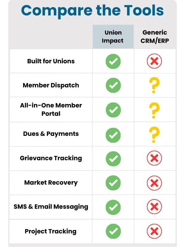
Union Impact was founded on one principle: unions deserve software designed for them—not retrofitted business tools. By handling migration, integrating core modules, and focusing on compliance and transparency, Union Impact gives locals the tools to stay organized, retain members, and grow.
To hear directly from locals using our platform, see Union Client Testimonials.


